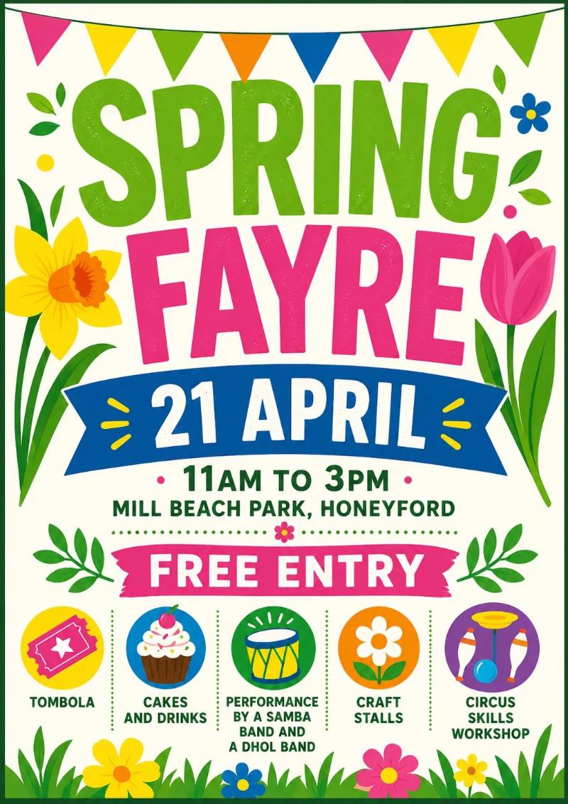
The hate for AI is reaching new heights. I ran across an article about how the posters that AI makes to advertise events are awful. Their example of a poster that was exactly what they were trying to avoid is colorful and uses large fonts to talk about the date, time, and name of the event.
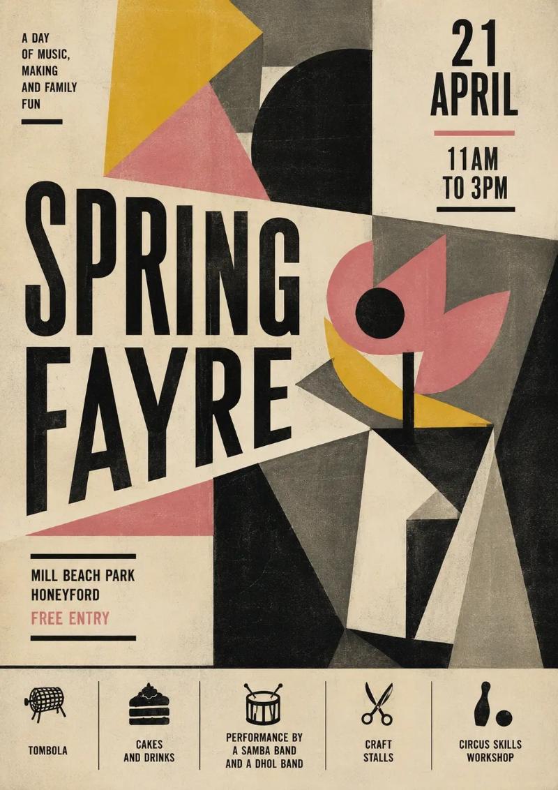
There's quite a bit of discussion about what makes a good poster, and they ended up with something that I absolutely detest, and for some reason they seem to think it's better.
Take a look. Let me know. Do you really think the second is better than the first? I don't.